#### Diving into code
A couple of things before we get started:
* Although I’ll be as clear as possible, I’m assuming you have some experience with React and already have [your project set up](https://reactjs.org/docs/create-a-new-react-app.html).
* I’m using search for countries as an example, but this component can be used for any kind of search, filter, or select fields.
#### Set up the hooks.
We’re going to design our suggest-as-you-type component to be reusable anywhere. The idea being, we should be able to pass data in and the thing just works.
Let’s start with creating a new file. We’ll call Autocomplete.js:
```javascript
// Autocomplete.js
import React, { useState } from "react";
const Autocomplete = props => {
const items = props.countries;
const [state, setState] = useState({
activeItem: 0,
filteredItems: [],
displayItems: false,
inputValue: ''
})
}
export default Autocomplete;
```
You’ll notice we’re importing `useState`, and loading the data (`props.countries`) into an `items` variable. In my case, I’m working with a list of countries, but this could be _anything_ you want your users to search for.
Next, we’re using `useState` to initialize state variables. This should be self explanatory, but here’s a quick walkthrough. Since we’re using React hooks, the state will hold all our logic, and we’re initializing it with some default values:
1. `activeItem` is the index of current selected item. Since nothing is selected when the page loads, we’ll set it to 0.
2. `filteredItems` is initialized as an empty array to hold our filtered country list.
3. `displayItems` will toggle the drop down menu of filtered items, initialized as false, so it doesn’t display on load.
4. and `inputValue` will capture the text the user types in the input field.
#### Adding the markup.
The markup for this is pretty simple, we just need to have an input field, and a [ternary operator](https://developer.mozilla.org/en-US/docs/Web/JavaScript/Reference/Operators/Conditional_Operator) that checks if the list should be displayed or not.
```javascript
// Autocomplete.js
import React, { useState } from "react";
const Autocomplete = props => {
const items = props.countries;
const [state, setState] = useState({
activeItem: 0,
filteredItems: [],
displayItems: false,
inputValue: ''
})
return (
)
}
export default Autocomplete;
```
Let’s have a look at what’s going on here. After our input field, we have this line:
```javascript
{state.displayItems && state.inputValue.length && state.filteredItems ?...
```
That’s a bunch of conditions that need to be true before we display the drop down list of filtered countries. It’s saying,
* “If `displayItems` equals `true`
* “and `inputValue` isn’t empty (the user has entered characters into the input field),
* “and there are `filteredItems` to display (we’ve matched items from our big list to the text the user entered in the input field),
* “then display the drop down list.
* “IF any of those conditions are _false_ then don’t display the list (`: null`).”
Next, we added code for our drop down list. We’re using `.map()` to iterate through our `filteredItems` to create all the list items.
You’ll notice, at the end, I’ve added `.slice(0, 10)` because I only want to display up to ten matching countries at a time. Feel free to remove this or set any other limit you prefer.
Excellent, so far we’ve set up our state logic, input field, and drop down menu. All we have to do now is make this thing work!
#### Events
Let’s start by reviewing the great experience we want to deliver to our audience. We know that users will type a country name into the input field, and we’ll have to capture what they type.
We also want to provide shortcuts for people using a keyboard. For example, pressing arrow keys should allow the user to navigate up or down to highlight countries. Pressing the enter key should allow users to select a highlighted country.
In summary, our users should be able to:
* Type a country name in the search field.
* Press/tap “enter” to select a country.
* Arrow up and arrow down to navigate the filtered list.
* Click on a country name to select that country.
Let’s code those events!
#### Ch-ch-changes
Let’s start with capturing the text entered in the input field by creating a `handleChange` function:
```javascript
// Autocomplete.js
...
const handleChange = (e) => {
const inputValue = e.currentTarget.value;
const filteredItems = items.filter(
(optionName) => optionName.toLowerCase().indexOf(inputValue.toLowerCase()) > -1
);
setState({
activeItem: 0,
filteredItems,
displayItems: true,
inputValue: e.currentTarget.value
});
};
...
```
This is all pretty standard, but let’s take a look at the `filteredItems` variable. We’re using the `.filter()` method to filter our big list of countries down to only the countries that match whatever text has been entered into the input field.
`optionName.toLowerCase().indexOf(inputValue.toLowerCase()) > -1`
We use `toLowerCase()` because we want our filter to be case insensitive by setting all entries in our list and the text entered in the input field to lowercase text. If there are no matches, it returns an empty array.
Then we update our state with `setState({...})`. You’ll notice we’ve updated the `filteredItems` state, set `displayItems` to _true_, and captured the text entered into the input field in `inputValue`.
Remember all those conditions we set above? This little bit of code handles all of that.
Now we can update the return statement to watch out for the `onChange` event:
```javascript
// Autocomplete.js
...
return (
)
...
```
Adding `onChange={handleChange}` tells the search field to watch for any changes like adding or deleting text. As user types in the search field, the `handleChange` functions runs and updates the `state`.
#### Clickety-click.
We want users to be able to click an item in the list to select a country.
```javascript
// Autocomplete.js
...
const handleClick = (e) => {
setState({
activeItem: 0,
filteredItems: [],
displayItems: false,
inputValue: e.currentTarget.innerText
});
};
...
```
Very simple! When a user clicks a country name in the filtered list, all we need to do is update the state with `setState`. You’ll see that we’ve reset all of state values, except for adding the text of the list item to the input field.
As above, we need to update the markup to capture the `onClick` event:
```javascript
// Autocomplete.js
...
return (
)
...
```
We’ve updated the list items in the filtered list with `onClick = {handleClick}` which will watch out for any clicks on the country items in the list, and trigger the `handleClick` function.
#### Unlock shortcuts with keyDown.
We’re going to make our component even more convenient for users by allowing them to use up, down, and enter keys to navigate and select an item from the list. To do this, we can add a handler for the `onKeyDown` event.
```javascript
// Autocomplete.js
...
const handleKeyDown = (e) => {
const { activeItem, filteredItems } = state;
if (e.keyCode === 13) { // keyCode 13 is the "enter" key
setState({
activeItem: 0,
filteredItems: [],
displayItems: false,
inputValue: filteredItems[activeItem]
});
}
else if (e.keyCode === 38) { // keyCode 38 is the up arrow key
e.preventDefault();
if (activeItem === 0) {
return;
}
setState({
activeItem: activeItem - 1,
filteredItems,
displayItems: true,
inputValue: e.currentTarget.value
});
}
else if (e.keyCode === 40) { // keyCode 40 is the down arrow
e.preventDefault();
if ((filteredItems && activeItem === filteredItems.length - 1) || activeItem >= 9) {
return;
}
setState({
activeItem: activeItem + 1,
filteredItems,
displayItems: true,
inputValue: e.currentTarget.value
});
}
};
...
```
Okay, this code is complicated, so let’s walk through it:
1. First, if the user pressed the enter key, `if (e.keyCode === 13)`, then we select the highlighted country from the list, the `activeItem`, using `inputValue: filteredItems[activeItem]`, and reset all other state variables to their defaults.
2. If the user presses the up arrow key, `else if(e.keyCode === 38)`, we first check if the current `activeItem` is at the top of the list. If so, then we do nothing, but, if it’s not at the top of the list, we update the `state` to decrement the index, and update the `inputValue` text that appears in the input field.
3. Finally, if the user presses the down key, `else if (e.keyCode === 40)`, we check if there are items in the list, and, if so, update `state` and increment the index, updating the text in the input field.
Does that make sense?
Here’s the complete code to this point:
```javascript
// Autocomplete.js
import React, { useState } from "react";
const Autocomplete = props => {
const items = props.countries; // This could be a GET request to whatever
const [state, setState] = useState({
activeItem: 0,
filteredItems: [],
displayItems: false,
inputValue: ''
})
const handleChange = (e) => {
const inputValue = e.currentTarget.value;
const filteredItems = items.filter(
(optionName) => optionName.toLowerCase().indexOf(inputValue.toLowerCase()) > -1
);
setState({
activeItem: 0,
filteredItems,
displayItems: true,
inputValue: e.currentTarget.value
});
};
const handleClick = (e) => {
setState({
activeItem: 0,
filteredItems: [],
displayItems: false,
inputValue: e.currentTarget.innerText
});
};
const handleKeyDown = (e) => {
const { activeItem, filteredItems } = state;
if (e.keyCode === 13) {
setState({
activeItem: 0,
filteredItems: [],
displayItems: false,
inputValue: filteredItems[activeItem]
});
}
else if (e.keyCode === 38) {
e.preventDefault();
if (activeItem === 0) {
return;
}
setState({
activeItem: activeItem - 1,
filteredItems,
displayItems: true,
inputValue: e.currentTarget.value
});
}
else if (e.keyCode === 40) {
e.preventDefault();
if ((filteredItems && activeItem === filteredItems.length - 1) || activeItem >= 9) {
return;
}
setState({
activeItem: activeItem + 1,
filteredItems,
displayItems: true,
inputValue: e.currentTarget.value
});
}
};
return (
<>
)
}
export default Autocomplete;
```
#### How to use it
Running this should provide you with the filtered list in a drop down under the search field. Save the file and add the component in any app or component like this:
```javascript
// App.js
import React from 'react';
import './App.css';
import Autocomplete from "./Autocomplete";
import {countriesList} from "./Countries"; // <-- just an array of countries. This could be a Fetch request or something.
function App() {
return (
);
}
export default App;
```
* * *
#### How about some extra credit?

###### *Give your customers an experience that makes sense.*
#### Let’s imagine,
you want a simple experience that lets your audience add as many items as they want.
Instead of selecting a single item, you might ask your customers to add a list of countries, or groceries, or clothes, or whatever. That would be pretty cool, right?
Adding this capability also gives us an opportunity to explore a couple of other React hooks.
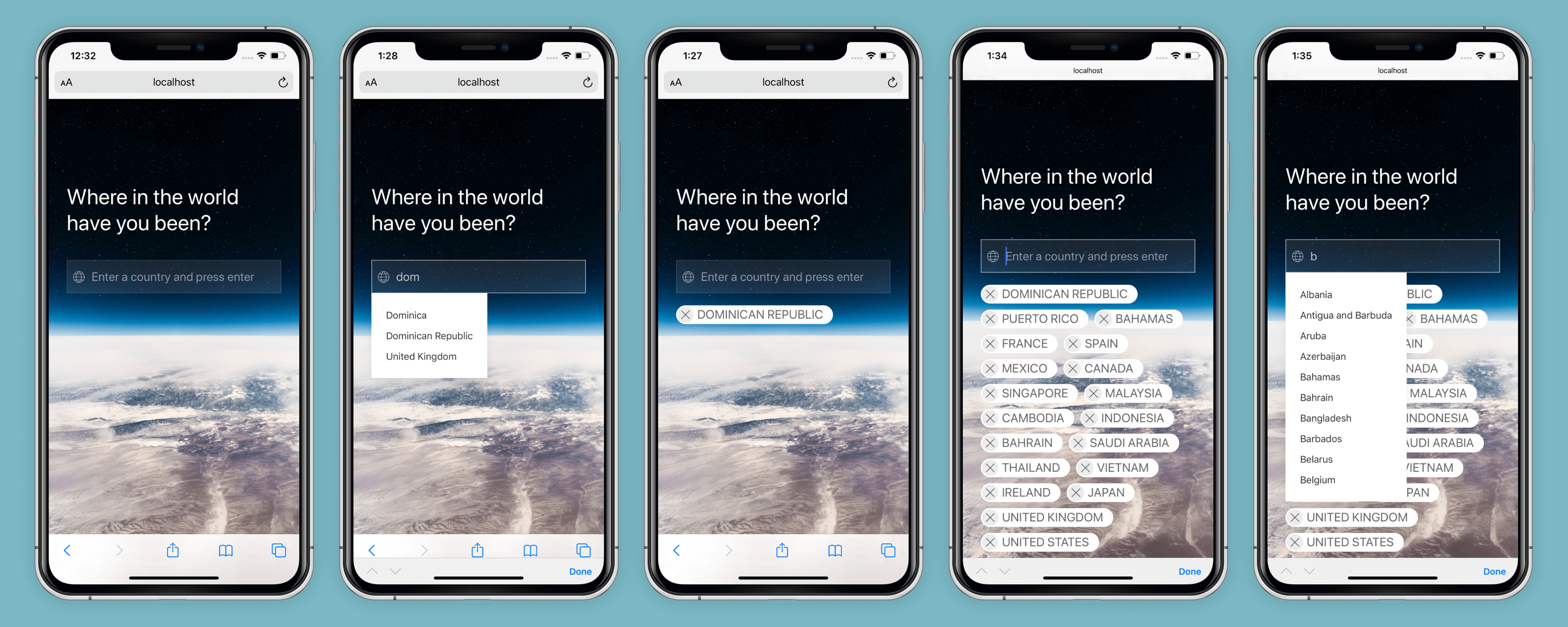
In the end, your component will behave and look something like this:

###### *A K.I.S.S. experience for everyday people.*
#### First thing first
We’ll import some additional hooks:
```javascript
import React, { useState, useEffect, useRef, useReducer } from “react”;
```
We’ll be using `useRef` as a placeholder variable for our list items. Not much more to say about it. The `useEffect` hook will be our trigger function to add countries to an array, which can then be passed to your form submit.
But, what’s up with `useReducer`? I won’t go into the [docs or details](https://reactjs.org/docs/hooks-reference.html#usereducer) because there are countless, somewhat confusing, articles and tutorials out there. The only thing I have to say is, when you find that `useState` isn’t working because state logic is complicated or you’re using complex arrays, then it might be a good time to try `useReducer`. Heads up, it’s pretty cryptic stuff, so let’s walk through the code:
```javascript
// Autocomplete.js
...
const fieldRef = useRef();
const [selected, dispatchSelected] = useReducer((state, action) => {
switch (action.type) {
case "add":
return [...state, { id: state.length, name: action.name }];
case "remove":
return state.filter((_, index) => index !== action.index);
case "empty":
return []
default:
return state;
}
}, []);
...
```
Just like with `useState`, we’re setting state variables. In this case, the variable we’re creating is called `selected`. The `selected` state will become our array to store the selected items from the list of countries.
Also, like with `useState`, we have a second “trigger” variable here called `dispatchSelected`. That’s where the similarities end, because `useReducer` is actually a trigger method that “dispatches” deep updates to the component’s state.
We use a [switch statement](https://developer.mozilla.org/en-US/docs/Web/JavaScript/Reference/Statements/switch "Learn about switch statements here.") to check the different cases we will trigger. We want users to be able to _add_ and _remove_ countries from the array.
In the case that the user adds a country to the array, `case "add":`, we have this bit of code:
`return […state, { id: state.length, name: action.name }];`
Basically that’s saying, “send back the current list of countries the user has already added, and _add_ the new country the user selected”.
When the user removes a country from the array, `case: "remove:"`, this bit of code:
`return state.filter((_, index) => index !== action.index);`
says, “send back the current list of countries, but _remove_ the country the user deleted from the list”.
I told you it was cryptic, but don’t worry, it will become clear in a couple of paragraphs. We just need to add this next bit of code to handle the `useReducer` function.
```javascript
// Autocomplete.js
...
function handleAddItems(e) {
dispatchSelected({
type: "add",
name: e
});
}
...
```
Do you get it now? To be honest, I didn’t at first, but I’m not always the brightest bulb.
`dispatchSelected` is our “trigger” method that tells the `useReducer` function what to do.
* `type: "add",` obviously means we’re adding a country to the list.
* `name: e`, (event) represents the specific country item to be added.
So, we can look at the `case "add":` line again and it’s starting to make some sense:
`return […state, { id: state.length, name: action.name }];`
* `...state` represents the current list of countries.
* `id: state.length` is the index of the new selected item in the list, and
* `name: action.name` is the name attribute passed on by the `handleAddItems` event. That is, the name of the country to be added.
So there’s a lot of voodoo and wishes that occur behind the scenes to make that work, but whatever, it works!
Now we need to update the `handleClick` and `handleKeyDown` event functions like this:
```javascript
...
const handleClick = (e) => {
setState({
activeItem: 0,
filteredItems: [],
displayItems: false,
inputValue: e.currentTarget.innerText
});
fieldRef.current.value = ""; // <-- New
handleAddItems(e.currentTarget.innerText); // <-- New
};
const handleKeyDown = (e) => {
const { activeItem, filteredItems } = state;
if (e.keyCode === 13) {
const inList = filteredItems && items.includes(filteredItems[activeItem]);
if(!inList || !fieldRef.current.value) return;
setState({
activeItem: 0,
filteredItems: [],
displayItems: false,
inputValue: filteredItems[activeItem]
});
fieldRef.current.value = ""; // <-- New
handleAddItems(filteredItems[activeItem]); // <-- New
}
else if (e.keyCode === 38) {
e.preventDefault();
if (activeItem === 0) {
return;
}
setState({
activeItem: activeItem - 1,
filteredItems,
displayItems: true,
inputValue: e.currentTarget.value
});
}
else if (e.keyCode === 40) {
e.preventDefault();
if ((filteredItems && activeItem === filteredItems.length - 1) || activeItem >= 9) {
return;
}
setState({
activeItem: activeItem + 1,
filteredItems,
displayItems: true,
inputValue: e.currentTarget.value
});
}
};
...
```
We’re adding
```javascript
fieldRef.current.value = "";
handleAddItems(
);
```
to our `handleClick` and `handleKeyDown` functions. Important note, depending on whether the user clicks or presses the enter button, the `handleAddItems` argument is different. That’s because a click event action takes place on the list item, but the enter key takes place on the array itself.
Anyway, our reducer and handler functions are ready to go, we just need to update the markup with this:
```javascript
// Autocomplete.js
...
{itemsArray.map((item, index) => (
dispatchSelected({ type: "remove", index })} />
{item}
))}
{itemsArray.map((item, index) => (
dispatchSelected({ type: "remove", index })} />
{item}
))}
Of course, you can get the complete code on my Github:
Get it on GitHub
Or, check out a live example.
#### Hey, thanks for reading, I really appreciate it.
I hope this was helpful for you. Feel free to get in touch with questions, revelations, insults, etc.