Animate a Better Experience with Tab Navigation and React-spring.
Your audience will love you if you give them a loving UX-in-Code experience.
Posted on Jan 12, 2020
###### *Tabs are great UX, but they shouldn’t get in the way of your content.*
### “How do we communicate our big creative message _and_ convert sales, on tiny little phone screens — in less than 2 seconds?”
> The lamenting cries of marketers everywhere.
Brands need to address problems they never had to deal with before. Challenges like screen resolution, legibility, user experience, gestures, taps, swipes, and more …
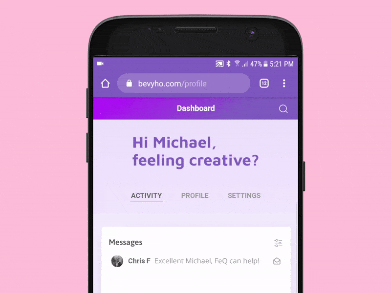
###### *This is what we’re going to make. Simple, right?*
More so, visitors are spending way too much time closing popovers, scrolling, blocking, and not enough time looking at your content. Content _promised_ in a paid ad.
### On mobile devices, your website should feel like a native app.
The goal is to reach and excite people in their world — not force them to adapt to ours.
In this UX-in-Code piece, we’re going to take a tiny bite out of the big tech picture and add a lot of flavor with a swipe. We’re going to make an animated tab model that delivers your amazing content in a compelling and intuitive way.
##### Watch the video
* * *
### Let’s start coding.
#### First, let’s install a couple things.
I’m assuming you have a [React dev environment](https://reactjs.org/docs/getting-started.html) set up, so I’ll skip that part.
I’ve tried a few React animation packages, and the winner is react-spring. It’s easy to use, well documented, a lot of example code, and comes with a very active community. Get info and sample code [here](https://www.react-spring.io/).
Also, since we’re targeting touchscreen devices, we’ll need to install the _react-use-gesture_ package. Get info and sample code [here](https://www.npmjs.com/package/react-use-gesture).
Install both with `npm install react-spring react-use-gesture`.
#### A little side note…
This article is not a tutorial for creating a tab UI component. Rather, we’re going to focus on moving your tabs out of the way when your audience is engaged in your content!
In my case, I chose to customize the [UIKit](https://getuikit.com/docs/tab) tabs module. However, [there](https://codesandbox.io/s/ojlvn780r6) [are](https://alligator.io/react/tabs-component/) a [ton](https://medium.com/@diegocasmo/a-simple-react-tabs-component-47cac2cfbb5) of React tab examples out there, so you should use what you like and feel most comfortable with, it really doesn’t matter.
#### The “Tabs” component.
We’re going to create our Tabs as a reusable component that can be imported into any component or app. Let’s start by creating a new file called `Tabs.js`.
```javascript
// Tabs.js
import React, { useState } from "react";
import { useSpring, animated } from "react-spring";
import { useGesture } from "react-use-gesture";
import "./Tabs.css";
const Tabs = ({ tabLabels, children, ...props }) => {
const [tabsExpanded, setTabsExpanded] = useState(true); // set initial tab state to expanded
return (
);
}
```
You see what I did there? We’re using React hooks to toggle our component between expanded/collapsed positions. We’re also importing the `useSpring` hook and `animated` from react-spring, to generate our animations, and `useGesture` to trigger touch events. But, more on that later.
The `tabLabels` argument is a list of labels, which will be displayed as separate tabs. For example, you could make it
`["Sign Up", "Pricing", "Contact Us"]`
The `children` argument let’s us include our tab content in the component, and `...props` is used pass other stuff to the component, like `className` or anything else we’re interested in.
Next, we set `useState(true)` to initialize the expanded state. Meaning, when someone lands on the web page, the header content and tabs are expanded, displaying the big headline, as well as our tab navigation.
At the moment, we only have our Tabs container and a headline. If we run this code, we won’t see much other than the headline. So let’s add our tab buttons!
```javascript
// Tabs.js
...
const Tabs = ({ tabLabels, children, ...props }) => {
const [tabsExpanded, setTabsExpanded] = useState(true); // set initial tab state to expanded
return (
);
}
...
```
There’s quite a bit going on here, so let’s walk through it.
After the headline, we’ve added a new `div` for the tab buttons, and included this to the className:
`${tabsExpanded ? "tabs-default" : "tabs-collapsed"}`
That’s called a [ternary operator](https://developer.mozilla.org/en-US/docs/Web/JavaScript/Reference/Operators/Conditional_Operator), and it’s saying,
* IF `tabsExpanded` is _true,_ then add the CSS class `"tabs-default"`
* or ELSE, the class is `"tabs-collapsed"`.
But, where does `tabsExpanded` come from? Remember, up above where we added the`useState(true)` variable, setting our `tabsExpanded` to _true_? Yep, there it is.
I’m guessing you see where we’re going with this. We’ll be using `useState` with our `setTabsExpanded` variable to toggle the position of our Tabs!
The last thing we added in this chunk of code is `tabLabels.map()`, which iterates through a `tabLabels` array, creating the tab buttons. So, here’s a little explanation about why we’re doing it this way…
> We want our Tabs component to be importable _everywhere!_
That means, we should be able to pass a variable to inform our Tabs of what content they should load when someone clicks on them. Otherwise, we’ll have to copy&paste code in every single page that uses tabs. That’s a terrible thing to do.
So, instead, we’re going to be really, super smart and just pass a bunch of labels, so that we can then use them as IDs to load the content we want for each tab. Get it? Got it? Good!
Here’s a quick review of what we’ve accomplished so far:
1. We’ve created a reusable Tabs component.
2. In the Tabs component, we’re using `useState` to initialize the default, expanded view of our tabs.
3. And, we’re using `.map()` to loop through an array of tab labels to create the tab buttons and identify the content we want to load when someone clicks on a button.
Wow, that’s a lot of progress for so little code.
#### Setting up touch gestures.
Now that we’re displaying our tabs, we need to make it work with touch screen gestures. That is, we want our tabs container to collapse when users swipe up, and expand when they swipe down. We can do this with `useGesture`, like this:
```javascript
// Tabs.js
...
const bind = useGesture({
onDrag: ({ down, direction: [, y], delta: [yDelta] }) => {
const trigger = Math.abs(yDelta) >= 1;
const dir = y > 0 ? -1 : 1; // we only care if the user swipes on the y-axis (up/down)
if (!down && trigger) dir < 0 ? setTabs(true) : setTabs(false);
}
})
...
```
Okay, this 7-lines of code is a little tricky, so let’s read through it line by line:
`onDrag: ({ down, direction: \[, y\], delta: \[yDelta\] }) => {`
Attach an `onDrag` event to capture swipe gestures, and add the built-in arguments `down`, `direction`, and `delta`. Since we only care about _up_ and _down_ swipes, we just want the `y-axis` direction and `yDelta`.
`const trigger = Math.abs(yDelta) >= 1;`
Set a `trigger` variable to trigger the animations. The code is saying, “if the absolute value of `yDelta` is greater than or equal to 1, then the value of `trigger` is _true_”.
`const dir = y > 0 ? -1 : 1;`
Set the direction variable, `dir`. This ternary operator says, “if the user swipes down on their screen (`y > 0`), then `dir` is equal to -1, or else, `dir` equals 1, on swipe up”. Yes, that’s a bit unintuitive, but you know, whatever.
This is the line that makes it all work:
`if (!down && trigger) dir < 0 ? setTabsExpanded(true) : setTabsExpanded(false);`
This chunk of code is saying,
* “IF the gesture is NOT a simple tap (`!down`) and `trigger` is _true_ (the swipe exceeds our defined `yDelta`),
* “then check if the `dir` is _swipe down_ (`dir < 0`).
* “IF the swipe direction is _down_, then set the tabs container to an expanded state, `setTabsExpanded(true)`,
* “or ELSE set the tabs container to collapsed: `setTabsExpanded(false)`.”
Wow, I just read through that a couple of times and had a laugh. Hopefully, it’s clear enough for you. If not, let me know please!
#### Let’s get animated.
So far, we haven’t added any of our cool animation effects, and our tabs are still kinda boring. The good news is that react-spring makes this _very_ easy. Let’s add our animation code, with `useSpring`, like so:
```javascript
// Tabs.js
...
const tabStyle = useSpring({ // this is where react-spring does its thing
marginTop: tabsExpanded ? 0 : -60,
fontSize: tabsExpanded ? "1em" : "0em", // Animate text size
fontColor: tabsExpanded ? "rgb(126, 87, 194)" : "rgb(252, 250, 255)",
backgroundColor: tabsExpanded ? "rgba(252, 250, 255, 0)" : "rgb(126, 87, 194)",
config: { mass: 1, tension: 400, friction: 30 } // Add a little bounce on collapse
});
...
```
This should be self-explanatory, but here’s a little walkthrough:
We’re using the `useSpring` hook to set a bunch of CSS styles that are toggled based on whether our `tabsExpanded` variable is true or false.
For example, do you see that line `marginTop: tabsExpanded ? 0 : -60`? That’s the line that makes our tabs animate up and down. The code is saying,
* “IF `tabsExpanded` is _true_, then the top position of the component is 0px (expanded),
* “or ELSE the top position is -60px.”
Also, have a look at the line that says, `fontSize: tabsExpanded ? "1em": "0em"`. That’s the one that makes our headline text animate from big-to-small.
You can add more styles that you want to animate. In my case, the other animations I wanted are font color and changing the background color of the tabs container.
That’s all it takes, react-spring will do the rest! (react-spring… so awesome)
#### Attach our animation functions to the tabs.
We’re almost there! First, a quick recap of what we’ve accomplished so far:
1. We’ve created a reusable Tabs component.
2. We set up our code to watch for swipe up/down gestures.
3. We set up the styles we want to animate when users swipe.
Now we just need to stitch it all together by attaching our gesture event and animations to our Tabs. We’ll do that by updating the markup in our `return()` statement.
```javascript
// Tabs.js
...
return (
// <-- new
// <-- new
// <-- new
);
...
```
There are a couple of things we’re doing here. First, we’re updating `div`s to flag them as “animatable” with `
);
}
export default Tabs;
```
#### The CSS to make it work.
The CSS I’m using is subjective. In my case, I had very specific UX and interaction requirements in mind for this app.
```css
/* Tabs.css */
main {
height: 100vh;
overflow-y: scroll;
-webkit-overflow-scrolling: touch;
}
.flex-container {
position: fixed;
height: 100%;
display: flex;
flex-direction: column;
justify-content: flex-start;
overflow-y: scroll;
-webkit-overflow-scrolling: touch;
}
/* Tabs.css */
.tab-header-container {
position: relative; /* makes it work */
height: 60px;
margin-top: 0;
z-index: 1;
}
.tab-header-content {
/* specific to my layout, mileage may vary */
display: flex;
flex-direction: column;
justify-content: flex-end;
}
.tab-items {
display: flex;
flex-flow: row nowrap;
align-items: center;
justify-content: center;
}
.tab-items div > div {
text-align: center;
}
```
The key take-away is that the \`.tab-container\` will animate up (collapse), when the user swipes up, and animate down, when the user swipes down. I went with a hacky flexbox solution, but mileage may vary depending on your UI needs.
Now, if you run the code on a touch device, you should be able to swipe up or down, and watch in glee, as your tabs animate.

###### *Swipey goodness!*
#### That’s all good, but what about larger devices and desktop browsers?
Obviously, we don’t need, or want, our tabs to collapse when someone visits our PWA from a larger device, such as a tablet or desktop browser. Rather, we want the page to scroll intuitively, just like any other website, so our users get the expected behavior. Good for us, there’s a really simple solution for that:
```css
/* Tabs.css */
/* Add a media query! */
@media (max-width: 768px) {
main {
width: 100vw;
height: 100vh;
overflow-y: scroll;
-webkit-overflow-scrolling: touch;
}
}
```
Now, on larger devices and desktop browsers, your website will scroll as users expect. Perfect!
###### *Delivering the expected, and intuitive, scrolling experience for desktop.*
#### How to use it in your app
```javascript
// Implementation
// App.js (or whatever)
import Tabs from "./Tabs/";
...
YOUR TABBED CONTENT
...
```
Now that we have a reusable, Tabs component — along with gesture tracking and cool animations — we can drop it into _any_ component or app whenever we want!
#### Closing out, thank you,
For reading all the way to the bottom of the page. I hope you had fun UX/Code-ing to make a pretty cool React component!
I’d love to hear your questions, revelations, and insults, so feel free to reach out.
#### Also, get the code on GitHub.
Hi Michael, feeling creative?
Hi Michael, feeling creative?
{tabLabels.map((label, i) => (
))}
Hi Michael, feeling creative?
Hi Michael, feeling creative?
{tabLabels.map((label, i) => (
))}
Hi Michael, feeling creative?
{tabLabels.map((label, i) => (
))}
{children} //This loads your page content
Of course, you can get the complete code on my Github:
Get it on GitHub

